Importing Google Maps to Plot Data- Kait Farrell
From Gleon Fellowship
Contents
Skills Sharing: Importing Google Maps directly into R to visualize data
Why use this skill?
- Visually show differences between sampling locations based on some other parameter of interest
- Directly import maps from Google Maps or OpenStreet Map- ArcGIS not required (does require internet connection)
- Minimal coding needed to execute
R Package involed
- ggmap
- ggplot2
Challenges
- Adjusting map parameters to show focal area most effectively
- Zoom ranges from 3 (continent) to 21 (building), default value 10 (city)
- Obtaining code to fine-tune plot outputs (similar to ggplot)
- Details shown in code below include:
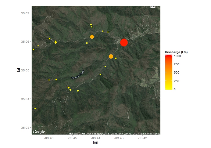
- Superimposing points from data file (ex. 'data') based on sampling lat/long where color and size both vary by discharge ('Q')
- Defining color scales and limits
- Defining size scale for plotted points
Example code
# Load relevant packages
library(ggplot2)

library(ggmap)
# Import dataset to superimpose over map
data <- read.csv("C:\\Users\\FarrellKJ\\Documents\\R\\mean_depth.csv", header = TRUE)
# Pull map from Google (e.g., location = c('Sunappe, NH') or specified lat/long (as below)
map <- get_map(location = c(lon = -83.44, lat = 35.05), zoom = 14, maptype = c('hybrid'))
# Plot map- 2013 Q
ggmap(map)
 + geom_point(aes(x = lat, y = long, colour=Q, size=Q), data = data)
 + scale_colour_continuous(name='Discharge (L/s)',limits=c(0,1000), low = "yellow", high = "red", space = "Lab", guide = "colorbar")
 + scale_size(guide='none', range= c(2,12), limits=c(0,1000), breaks=c(5, 50, 100, 400, 800))
